Keep your Sharepoint in sync. Download and try today.
How to visualize external data in SharePoint with Plumsail Dashboard Designer and BDLC
Data from 100+ external sources can be visualized in SharePoint sites with the help of the Plumsail Dashboard Designer and the Layer2 Business Data List Connector for SharePoint.
Integrating data in SharePoint is a great way to have all relevant information in one place. Too often, it is much more helpful to visualize this data in dashboards and diagrams. The Plumsail Dashboard Designer can help you here to create interactive and meaningful charts based on your integrated data.
In this article, we will create a dashboard to get insights of the current log status imported from a SQL database into a SharePoint list via the Layer2 Business Data List Connector (BDLC). Note that this is an example only. Virtually any data can be visualized.
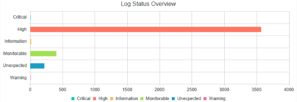
Fig.1: Log message count aggregated by status level
Configuring BDLC to connect to external data
It's easy to configure your external data source in the Layer2 Business Data List Connector List Settings dialog:
- Create a list in your SharePoint on-premises to cache the external SQL query result data. Click "Connect to external data source" in the General List Settings, select the data provider, enter connection settings and data query as shown below.
- Please select the .NET Framework Data Provider for SqlServer from the list of installed providers. If you cannot find, please install from Microsoft.
- You can make use of any connection strings for SQL Server as usual,
e.g.:
Data Source=myServer; User Id=myUser; Password=myPassword. - You will find more information about SQL Server data integration here: Microsoft SQL Server Data Integration with SharePoint.
- In order to reduce the amount of incoming data, you can add filters in the WHERE clause of the select statement so you have not to import irrelevant data into the list.
- In this example, I named the list “BDLC MyLogs” and created a view “NoVerboseNoMedium” to exclude log messages with the status “Verbose” and “Medium”.
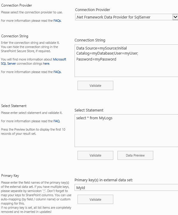
Fig.2: The BDLC configurations settings (sample)
Configuring Plumsail Dashboard Designer to visualize integrated data
Now your data should be present in SharePoint. You will have a list of a few thousand items (in our example there are 70k+ entries, don't worry about the list view threshold - no problem with this with BDLC), and that´s quite a number to look through without other tools.
This is when the Plumsail Dashboard Designer comes in.
- Download and install from the vendor page. After activating the product feature, open the site where you wish to display the chart in edit mode and hit “Insert” in the ribbon. There is a separate button “Plumsail Chart” that will insert a default webpart into the selected zone.
- Hit configure to open the settings section.
- Choose a SharePoint site as source, then the above-created list and the view. You can (de-)select all columns to integrate in the chart individually.
- Remove the row limit for our example.
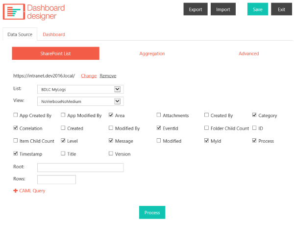
Fig.3: Data Source settings in Plumsail Dashboard Designer
- Move to the tab “Aggregation”. We want to display only the amount of different status messages in our log, so we define a new aggregation “MessageCount” as shown below.
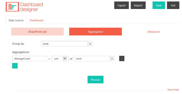
Fig.4: Aggregating
Now save and move on to “Dashboard”. Select an appropriate chart and configure the axis data. For our example, we selected the “Bar” chart, decided to display each greap as a separate serie and filled the Category and Value settings with the level field.
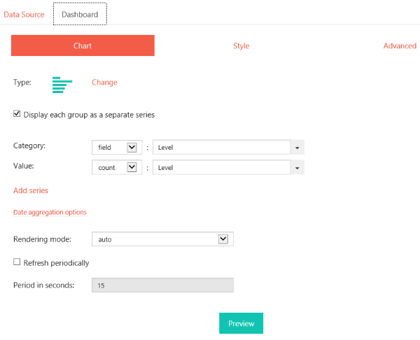
Fig.5: Chart Settings in Plumsail Dashboard Designer
Save your settings and exit the configuration settings. Now you should have a summary of your log statuses shown in a handy chart (as shown above), so that your maintenance team is always up to date about incoming errors.
This solution is optimized for Microsoft SharePoint Server on-premises. Similar solutions are available for SharePoint Online. Please contact sales@layer2solutions.com in case of any questions.
READY TO GO NEXT STEPS?
