Keep your Sharepoint in sync. Download and try today.
How to chart external data in SharePoint Online and Office 365?
You can visualize external list data in SharePoint 2013 or SharePoint Online using the BlackCompass Visualizer to chart together with the Layer2 Cloud Connector for SharePoint and Office 365 for data integration. Lots of common chart types supported with auto-update on data change, support for large datasets etc. Read the below for a step-by-step intro.
There are a lot of chart web parts for SharePoint on the market, but only a few for SharePoint Online and Office 365 because of the new SharePoint app model. The BlackCompass Visualizer uses the app model and Windows Azure to chart your data very fast and flexible.
Let's start with a simple list of customers in different countries from the well-known Northwind sample database.
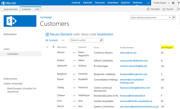
Fig.: SharePoint Online list to chart the number of customers by country (as a sample)
To chart the number of customers by country you need the app to be installed. You will find it in the Microsoft App Store.
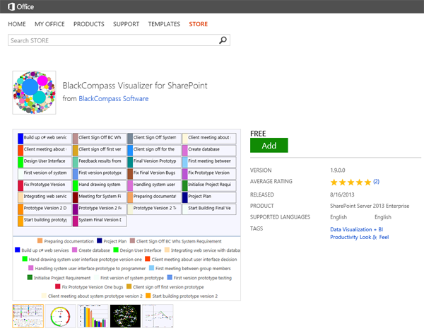
Fig.: BlackCompass Visualizer for SharePoint in the Microsoft App Store.
Simply add to your site as usual for SharePoint Apps. You can use SharePoint lists as a data source. Next click the BlackCompass visualize button in the ribbon of your list to connect. We select the Bubble Graph for our sample, with the following simple settings:
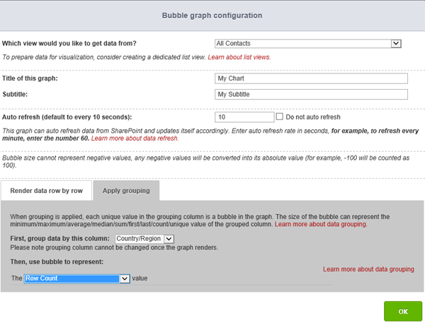
Fig.: Bubble Graph settings to count the number of items with the same Country / Region value.
Thats the resulted chart.
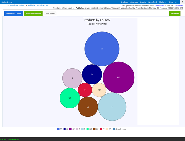
Fig.: Number of customers per country / region as a sample bubble graph.
There are many other graphs available with the app.
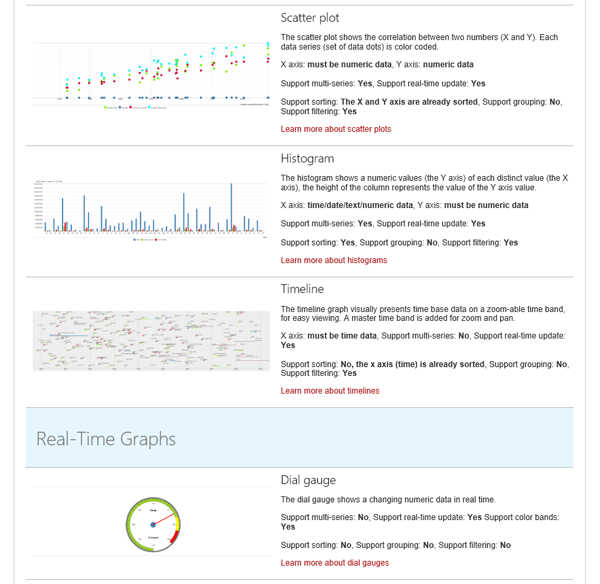
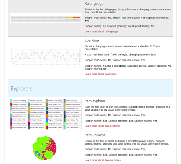
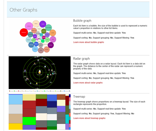 Fig.: Sample graphs available with
the BlackCompass SharePoint App to visualize list data
The charts can be published and updated automatically. Some charts are interactive and display further information on click.
But how to display external data? You can use the Layer2 Cloud Connector for SharePoint and Office 365 to sync your external data with native SharePoint list.
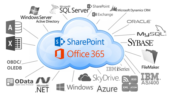
Fig.: Almost any external data source can be connected to native SharePoint lists using the Layer2 Cloud Connector for Office 365, also available as app.
Virtually any data sources supported: ODBC, OLEDB, Microsoft .NET based providers, Files (Excel, XML, CSV), RSS / XML feeds, SQL databases like MS SQL, SQL Azure, Oracle, MySQL, IBM DB2, IBM AS/400, IBM Informix, Notes, SharePoint (lists and libraries), local file system, cloud-based file stores, Exchange, Active Directory, Dynamics NAV/CRM, Navision, SAP and many more. More complex data sources, web services, custom COM or .NET objects, can be connected using 3rd party add-ons. Cloud-to-cloud connections e.g. to salesforce.com, Twitter, Facebook, Google etc.
For syncronizing e.g. a SharePoint list with a SQL Server query data source please see the video here.
Summary
If used together, both products, the BlackCompass Visualizer and the Layer2 Cloud Connector make it as easy as possible to visualize internal and external data with SharePoint 2013 and Sharepoint Online.
Explore frequently asked questions by topics.
Ready
to go next steps?
